Arts and Culture
BI and Analytics
Memberships
Presenting and Performance
Article
Success Stories
0190d129-3c5d-414f-a2a0-b26f53bc08fa
7 min
https://edge.sitecorecloud.io/tessituraneab9a-tessiturane5642-staging-5396/media/Images/Licensee-Photography/Photos_768x465/flynn_farmer_768x465.jpg?h=465&iar=0&w=768
Why better storytelling might be the key to widespread use of your audience insights
Unlock your data stories
10/4/2023
7 min
Want to increase data adoption in your organization? You might need to hone your storytelling skills.

Odele Peter
It’s a lesson learned the hard way by Odele Peter, Database Manager at Flynn Center for the Performing Arts in Burlington, Vermont. The center serves more than 110,000 people each year through more than 200 ticketed and free events, a student matinee series and education programs, plus a summer jazz festival. In her role, Odele seeks to maximize the value her organization gleans from its audience data. That means making better use of the reporting tools and business insights available in Tessitura.
Case in point: During the 2023 fiscal year, membership revenue at the Flynn started to fall behind totals from the previous year. The Flynn employs a contribution-based model, with 12-month rolling memberships and five program giving levels. Members get early access to tickets along with other benefits. The organization had made numerous adjustments to the program in recent years, including removing discounts and consolidating several higher membership levels into one.
“It can be daunting to tangle out what is causing a revenue drop.”
The team recognized that membership revenue was not on track to meet budget goals. But getting to the root cause of the budget shortfall was not as simple. They knew changes could be attributed to one or several factors. Those might range from fewer overall members or decreases in average gift size to lower renewal rates or members joining at lower-value levels.
“It can be daunting to tangle out what is causing a revenue drop,” Odele said. “So, I investigated each of these factors to determine the impact they had and to uncover what was relevant to the question.”
Investigate your data
Odele dug into the details. She looked at contributions broken down by campaign fiscal year. She filtered cumulative revenue and member counts by level and status and any combination of the two. Soon, she had considerable data to share with her colleagues.
“I had a vision of going to each department and sharing what I had learned and doing data analysis together,” she said. But that all changed following her first team meeting.
“As I presented the dashboards, there was growing confusion over what the charts were showing and how they related to one another,” she said. “We got sidetracked by data outliers. Exploration turned into explanation. My vision of a productive, exciting data dive turned into unfocused discussion that bounced from one topic to the next with no clear resolution. We ended with many more questions than answers.”

Young performers develop their own work in the Page to Stage theatre class. Photo by Luke Awtry Photography.
The team asked for a monthly tracking dashboard, the idea being that if all information could be viewed in one place it would be easier to interpret. However, though the resulting dashboard was rich in detail, it didn’t necessarily explain anything. It didn’t clearly show trends or highlight problems and opportunities.
The budget gap widened. Finding a solution became urgent.
“There were stories in these numbers, but they needed to be uncovered and told.”
“I knew there were answers there,” Odele said. “There were stories in these numbers, but they needed to be uncovered and told. That’s when I realized I had been primarily providing data up to this point when what we most needed was data analysis.”
The Flynn did not have the capacity to hire a new analyst. Nevertheless, Odele was keen to fill this critical gap.
“That’s when I had my aha moment,” she said.
Shape the narrative
Maybe your organization is similarly challenged. Perhaps you’ve been tasked with specific data responsibilities or would simply like to improve your data analysis skills. Odele outlines four key steps for how to shift your focus from simply providing data to serving as a data analyst.
1. Investigate questions.
This is the exploratory phase, where you collect and analyze data relevant to specific questions you need to answer.
“Tessitura Analytics was built for this,” Odele said. “Widgets are populated with data that can be filtered and visualized on the fly.”
2. Uncover the story.
In this stage, context is key. Who is your audience? What information have you found that’s relevant. How do you want to communicate it? Aim for simplicity.
According to Odele, “You should be able to sum up the story in a sentence or two.”
3. Present the narrative.
Designing appropriate visuals can help clarify your data story. Eliminate clutter. Don’t automatically accept application defaults for color, gridlines or labels. Be ruthless in what you select; include only the information that helps tell your story and nothing else.
“The best visual is free of distraction and delivers the message in the clearest possible way,” Odele said.
“The fact is, when you are the one analyzing the data, you are the expert.”
4. Make recommendations.
Data-driven decision-making doesn’t exist without action. Learn from your data and adjust your strategies to meet your goals.
“Analysis without this step will likely go nowhere,” she said. “A data analyst presenting the stories uncovered from data has a unique opportunity to provide recommendations on what those actions might be.”
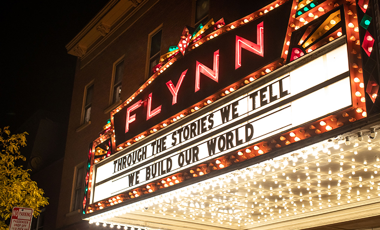
Photo of the marquee at the Flynn Center for the Performing Arts by Luke Awtry Photography.
This final step is sometimes neglected, but Odele says that’s a mistake. “I want to highlight this step not only because of how important it is but also because it did not come naturally to me at first,” she said. “In the beginning, I imagined working with departments on analytics more collaboratively. I thought I would be the analytics expert, not the subject matter expert.
“But the fact is, when you are the one analyzing the data, you are the expert,” she continued. “You can and should suggest action. If you don’t and simply present data, your audience may leave and move on to the next thing. You may not have all the context, but a recommendation can be a suggestion of next steps. Recommended actions can be ideas to start a discussion.”
Build more value
Odele put on her analyst’s hat to solve The Flynn’s membership puzzle. She identified several story themes within the available data.
In reviewing contributions, it was clear that membership revenue had trailed the previous fiscal year all along. Odele recommended the creation of a new dashboard to track key performance indicators and send status reports weekly to the development team so they could more easily and proactively monitor results. She found that average gift size had increased at most levels, and that revenue at the lowest membership level had increased. As a result, she recommended raising entry-level membership points since people were already giving more than the base suggestion.
Finally, Odele discovered that shifts among the highest-level donors were causing the biggest revenue drop. The bulk of the decrease was due to lower renewals and reinstates. She recommended personalized renewal plans for these key stakeholders. Creating a dashboard for staff quickly showed which donors were up for renewal. It also provided information that would be helpful in conversation, such as what performances they had just seen and which they were attending next.
“Having the ability, in house, to look at any issue that comes up or trend we’re seeing is just really, really valuable.”
Her new approach has made a huge difference. “It’s night and day,” Odele said. “When you’re able to find the story and then convey it in an easy way, you’re not getting confused looks. You’re getting a level of understanding that opens the door to figuring out what you can do about it.”
It’s also created a rewarding personal journey. “It’s been really exciting for me,” Odele said. “I admit I’m kind of an Analytics groupie at this point. I just see so much potential for our using that application. We can’t outsource this type of analysis. Having the ability, in house, to look at any issue that comes up or trend we’re seeing is just really, really valuable.
“Having Tessitura at the Flynn is having an incredible tool that allows us to do all our main business operations with one platform,” she continued. “It allows us to look at things in a way we couldn't if they were siloed and we didn't have one place where all our data resides. I'm always looking for ways to make sure we're keeping track, recording, inputting everything we can about people, so we have the whole picture.”
Top photo from Hug Your Farmer: Hard Rain, a benefit for Vermont farmers affected by flooding, by Ben Collins. Photo of Odele Peter by Michael Heeney Photography.
Topics
Arts & Culture
/BI & Analytics
/Memberships
/Presenting & Performance

 Success Stories
Ballet Austin boosts efficiency and engagement with Tessitura v16
BI & Analytics / Customer Service / Marketing
Forecasting, reporting and segmentation transform data into impact
 Success Stories
Can AI help find new customers and donors?
Technology / Audience Development / Digital / Arts & Culture
San Francisco Opera and California Academy of Sciences offer two success stories
 Success Stories
Making membership easy at the Houston Museum of Natural Science
Fundraising / Memberships / Arts & Culture / Museums
How moving to Tessitura improved automatic renewals, gift memberships and more